Shopiator

Free swipe file

Landing Page Swipes: Annotated Google Ads Landing Pages

9 real ecom pages, annotated by a Google Ads operator. Each one shows the search intent it fits, where it belongs in the account, what to copy and what to avoid.

How to use this swipe file

These are public pages captured on 5 November 2026 and shown for commentary. They belong to their owners. We do not know their performance, and nothing here says they run Google Ads. Pages change, so use the live link on each card. Want one removed? Email santosh@shopiator.com.

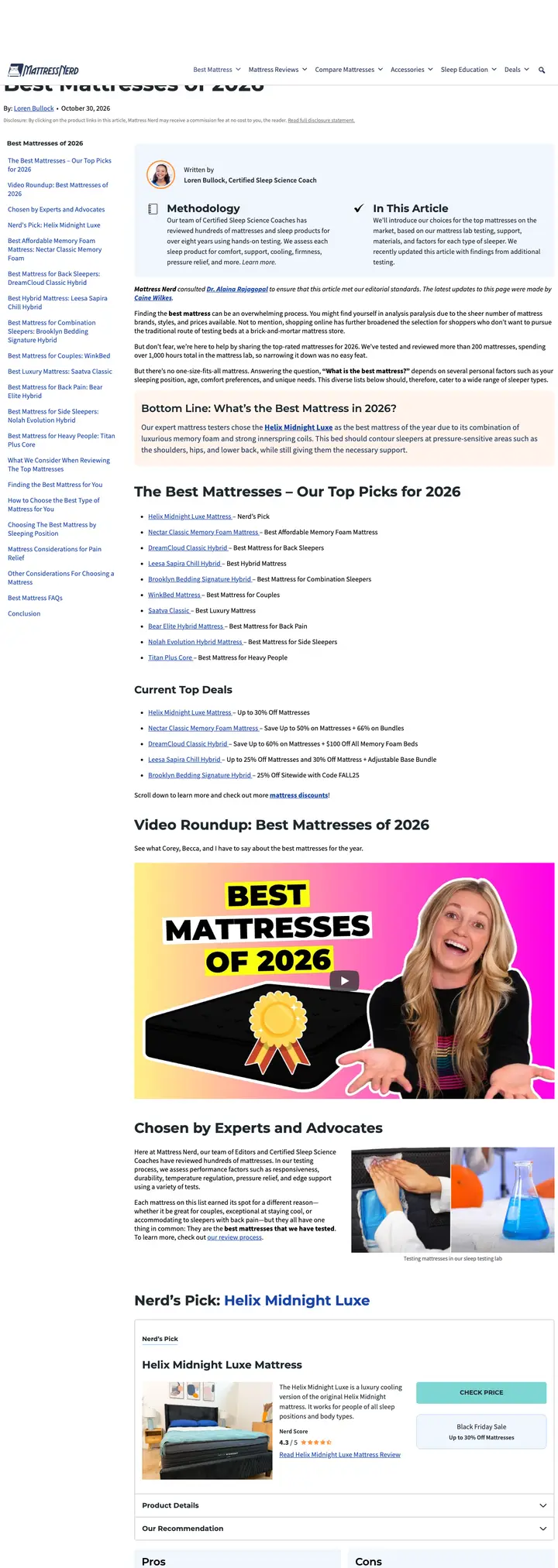
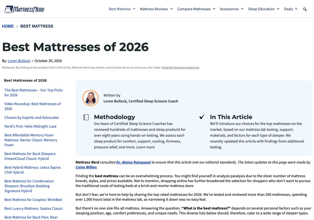
Mattress Nerd third-party review above the fold, captured 5 November 2026
View the full-page captureMattress Nerd third-party review full page capture
Third-party reviewMattresses

Mattress Nerd

A tested-and-ranked list that sends each sleeper type to its own pick. The page earns trust before it asks for a click.

Search intent it fits
Commercial investigation: "best mattress" and "best mattress for [sleeper type]"
Where it fits in the account
Not a brand's own landing page. Use it as the blueprint for a "best for X" section on your own collection or comparison page.

What is on the page

  • Named author with a sleep coach credential sits above the fold.
  • Methodology box states how many beds were tested and over what period.
  • Commission disclosure sits directly under the byline, before any product link.
  • Table of contents jumps to one pick per use case: back sleepers, couples, back pain.
  • Each pick has a "who might like it" and "who might not" block.

Copy this

  • Put the "who it's not for" block on your own pages. It lifts trust.
  • Name the person behind the testing and say what they tested.
  • Give every use case its own anchor so one page serves many queries.

Avoid this

  • Do not send ad traffic to a disguised review you own without a clear disclosure.
  • Ranking yourself first without showing criteria reads as an advertorial and invites policy trouble.
Visit the live page
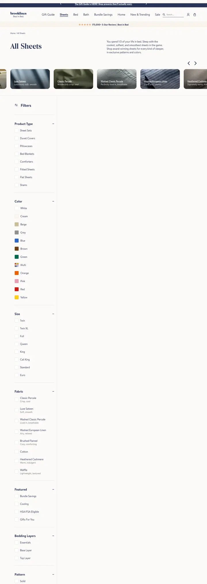
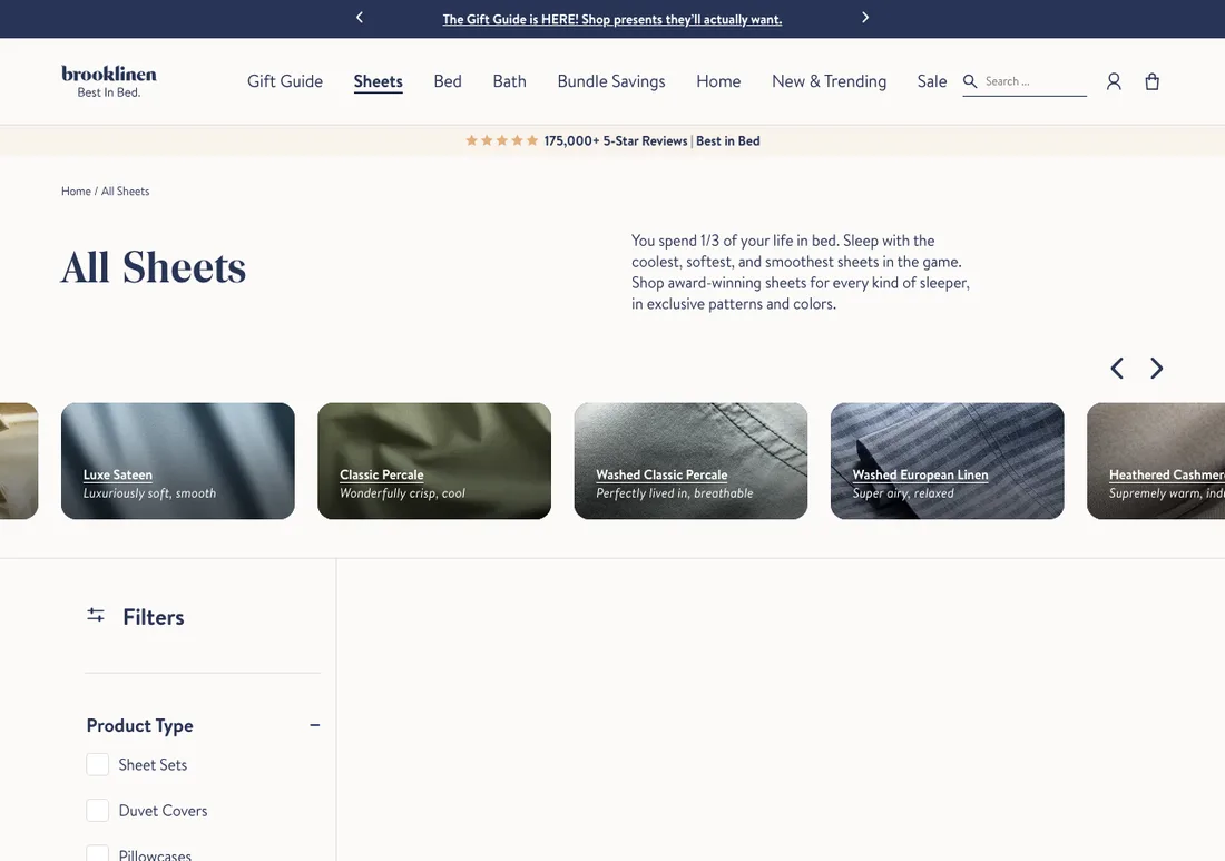
Brooklinen collection page above the fold, captured 5 November 2026
View the full-page captureBrooklinen collection page full page capture
Collection pageBedding

Brooklinen

A collection page that behaves like a buying guide: social proof first, then fabric tiles, then the grid.

Search intent it fits
Category head terms: "sheets", "bed sheets", plus fabric modifiers
Where it fits in the account
Converter landing page for category-level Search and Shopping or PMax asset groups where one product page is too narrow.

What is on the page

  • Review count bar sits directly under the header, above the page title.
  • One-sentence intro, then fabric tiles each with a feel descriptor like "crisp, cool".
  • Best seller badges and press badges sit on the product thumbnails.
  • Filters, an FAQ block and an email capture sit below the grid.
  • Promo bar in the header offers a first-order discount.

Copy this

  • Turn modifier searches into tiles. "Cooling sheets" and "linen sheets" become one-click filters.
  • Put the review count where it appears before the first product.
  • Describe the feel, not just the material, on each category tile.

Avoid this

  • Press and award badges must be current and verifiable. Stale badges are a trust and policy risk.
  • Keep the promo claim in the header identical to the one in your ads and feed.
Visit the live page
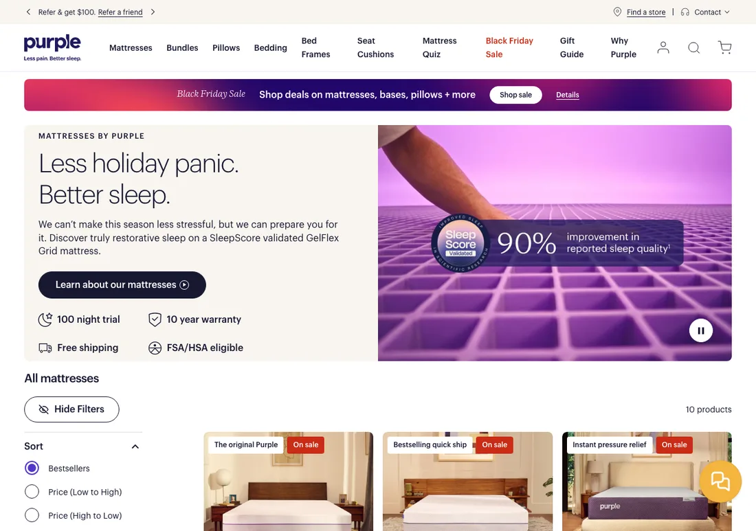
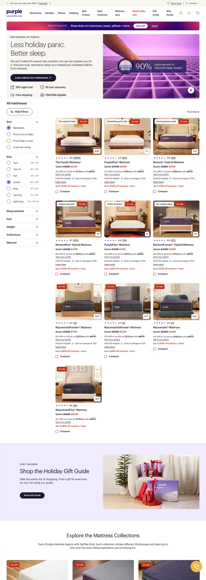
Purple collection page above the fold, captured 5 November 2026
View the full-page capturePurple collection page full page capture
Collection pageMattresses

Purple

A risk-reversal heavy collection page. Four trust points sit inside the hero, and every product carries a reason tag.

Search intent it fits
Brand plus category: "purple mattress", "purple mattress reviews", "mattress for back pain"
Where it fits in the account
Fits branded Shopping and branded Search, and warm remarketing. Weaker for cold non-brand because the hero is seasonal and brand-led.

What is on the page

  • Hero lists 100 night trial, 10 year warranty, free shipping and FSA/HSA eligibility as icons.
  • A validated-science badge sits on the hero image with a footnoted statistic.
  • Products sorted by bestsellers by default, each tagged with a reason like "Instant pressure relief".
  • Mattress quiz is in the main navigation.
  • Sale banner and sale badges run across the hero and every product.

Copy this

  • Put the four risk reducers in one icon row inside the hero.
  • Tag each product with the single reason to choose it.
  • Default the sort to bestsellers so new visitors see proof first.

Avoid this

  • Do not use a seasonal headline on a page that non-brand search lands on. Match the query instead.
  • Any statistic needs a visible source and footnote. Unsupported claims risk misrepresentation flags.
Visit the live page
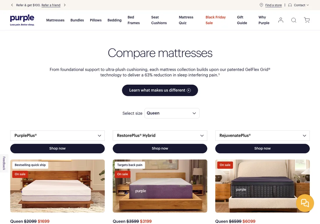
Purple comparison page above the fold, captured 5 November 2026
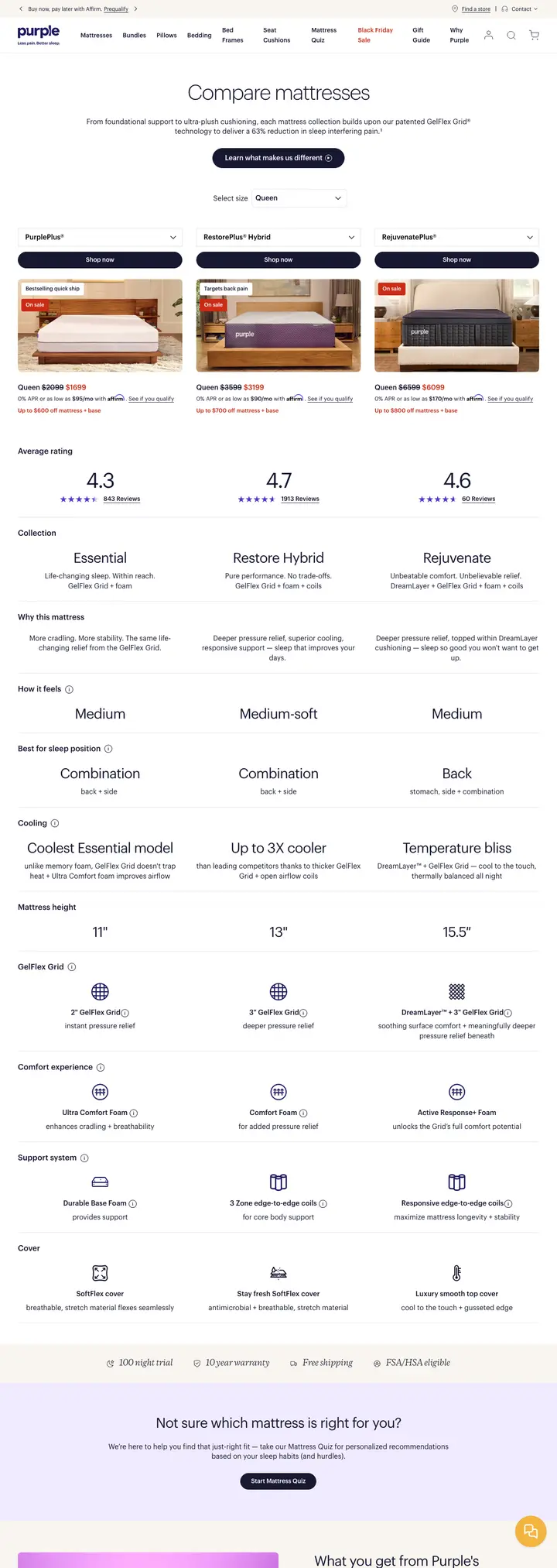
View the full-page capturePurple comparison page full page capture
Comparison pageMattresses

Purple

A side-by-side that sells within the table. Size picker first, three models in columns, a buy button above every column.

Search intent it fits
Which-one queries: "purple mattress comparison", "which purple mattress is best"
Where it fits in the account
Landing page for branded comparison queries and for middle-funnel remarketing. Can also back a branded Search ad group on model names.

What is on the page

  • Size selector sits at the top, so every price below is for the size chosen.
  • Three model columns with a drop-down to swap the model in that slot.
  • Shop now button sits above the images, not below a long spec table.
  • Reason tags on images, like "Bestselling quick ship" and "Targets back pain".
  • A "not sure which is right for you" prompt points to the quiz, then an FAQ.

Copy this

  • Ask for size or variant before showing price, so the price shown is real.
  • Let the shopper swap models inside the table without leaving the page.
  • Put the buy button at the top of each column.

Avoid this

  • Compare your own products only. Naming a competitor on the page can trigger trademark complaints.
  • Keep the footnoted outcome statistic tied to a source you can show.
Visit the live page
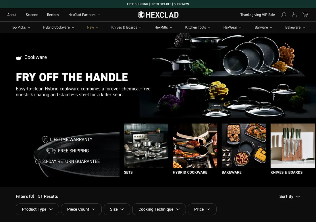
HexClad collection page above the fold, captured 5 November 2026
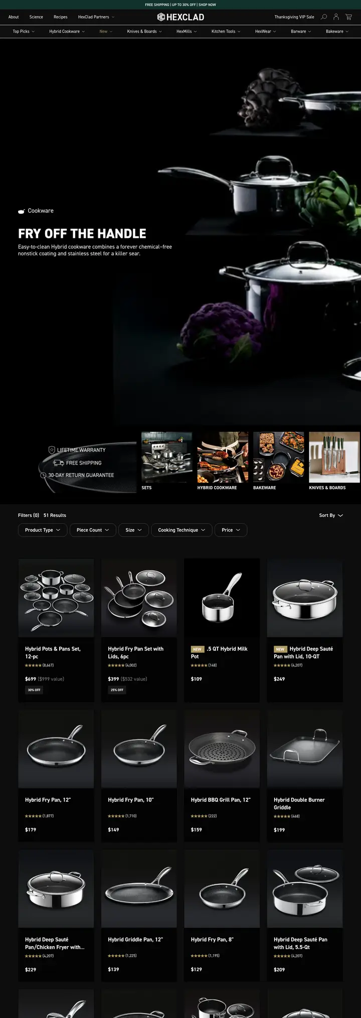
View the full-page captureHexClad collection page full page capture
Collection pageCookware

HexClad

A bold one-line hero, three guarantees, then a filter bar built around how people actually shop for cookware.

Search intent it fits
Category head terms: "cookware sets", "non stick pans", "stainless steel cookware"
Where it fits in the account
Converter Shopping or PMax destination for cookware head terms, where the filter set does the work of sub-collection pages.

What is on the page

  • Hero headline is a short slogan with one line of product proof underneath.
  • Lifetime warranty, free shipping and 30 day returns sit in a row next to the hero image.
  • Sub-collection tiles for sets, pans, bakeware and knives sit above the filters.
  • Filters are product type, piece count, size, cooking technique and price.
  • Result count is shown and an FAQ sits lower on the page.

Copy this

  • Build filters from your search terms. Piece count and cooking technique map to real queries.
  • Show the guarantees as icons directly beside the hero.
  • Put sub-collection tiles above the filters for shoppers who know what they want.

Avoid this

  • Health and safety wording like "chemical-free" needs substantiation before you copy it into ads or pages.
  • A deep mega-menu on a single-intent landing page lets paid traffic leak away.
Visit the live page
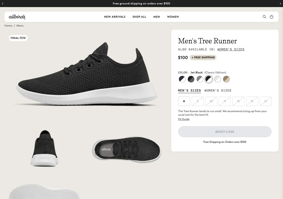
Allbirds product page above the fold, captured 5 November 2026
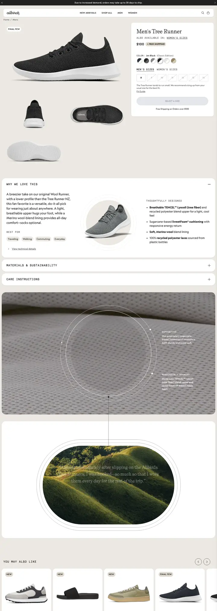
View the full-page captureAllbirds product page full page capture
Product pageFootwear

Allbirds

A clean product page where the decisions happen in order: colour, size, then a fit note right where the doubt sits.

Search intent it fits
Product and brand: "allbirds tree runners", "wool runners", "lightweight everyday sneakers"
Where it fits in the account
Destination for branded Shopping and exact-match product Search. Price, stock and shipping on the page must match the Merchant Center feed.

What is on the page

  • Price and a free shipping chip sit together next to the title.
  • Fit note says the shoe runs small and advises sizing up, with a fit guide link.
  • The add button reads "Select a size" and is disabled until a size is chosen.
  • Out-of-stock sizes are struck through in the selector.
  • Benefit tags, a style comparison and reviews sit below the buy box.
  • A top bar notes shipping may take up to 30 days.

Copy this

  • Put sizing advice next to the size selector. It cuts returns and support tickets.
  • Make the button text tell the shopper the next step.
  • Show a compare-our-styles block to keep a shopper who is unsure of this model.

Avoid this

  • Do not run ads to a product page with most sizes sold out. Check stock before scaling spend.
  • Shipping times, price and availability must match the feed, or products can be disapproved.
Visit the live page
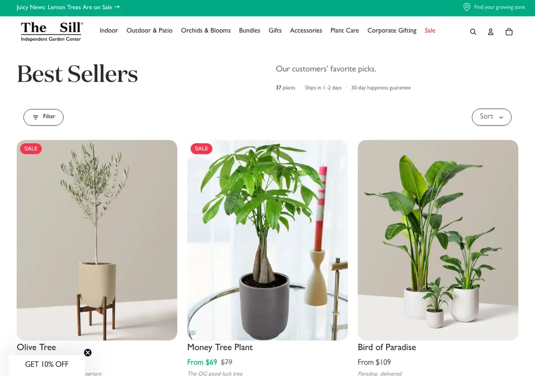
The Sill collection page above the fold, captured 5 November 2026
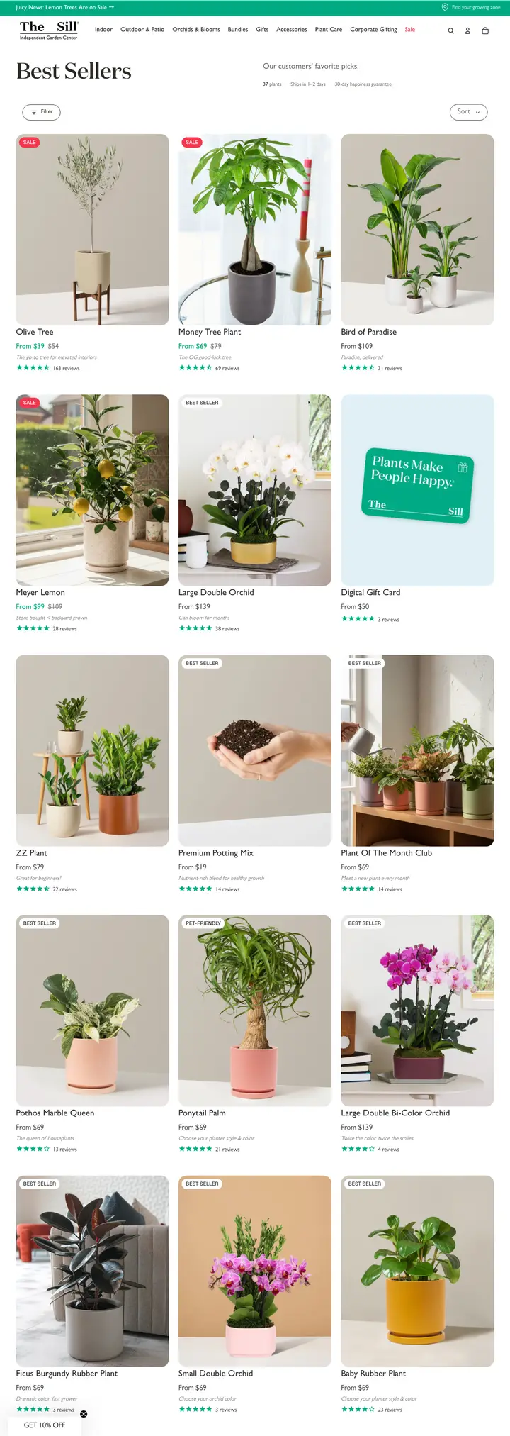
View the full-page captureThe Sill collection page full page capture
Collection pagePlants

The Sill

A best-sellers grid that answers shipping and risk in one line before the first plant.

Search intent it fits
Gift and best-of queries: "best indoor plants", "plants delivered", "easy houseplants"
Where it fits in the account
A landing page for broad Shopping and PMax traffic where the shopper has no specific plant in mind yet.

What is on the page

  • A single strip states plant count, ships in 1 to 2 days and a 30 day guarantee.
  • Short page title with a one-line promise of customer favourites.
  • Sale badges and was-now pricing on the products with a discount.
  • Each product has a one-line tagline under the name.
  • A discount widget sits in the bottom corner over the first row.

Copy this

  • Use a one-line strip for shipping speed and guarantee, directly under the title.
  • Write a short tagline per product. It answers "why this one" fast.
  • Show was-now prices only where the discount is real and provable.

Avoid this

  • A pop-up or widget over the first product row hurts the mobile ad experience.
  • "From" prices must match the lowest variant price in your feed.
Visit the live page
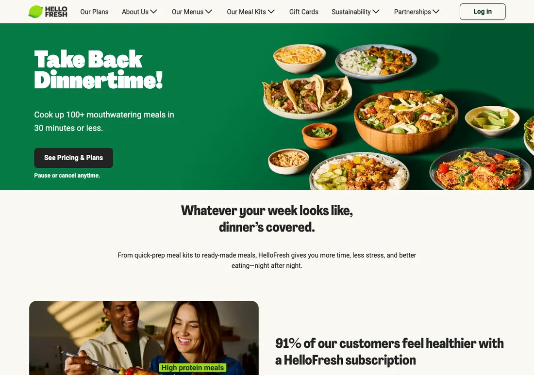
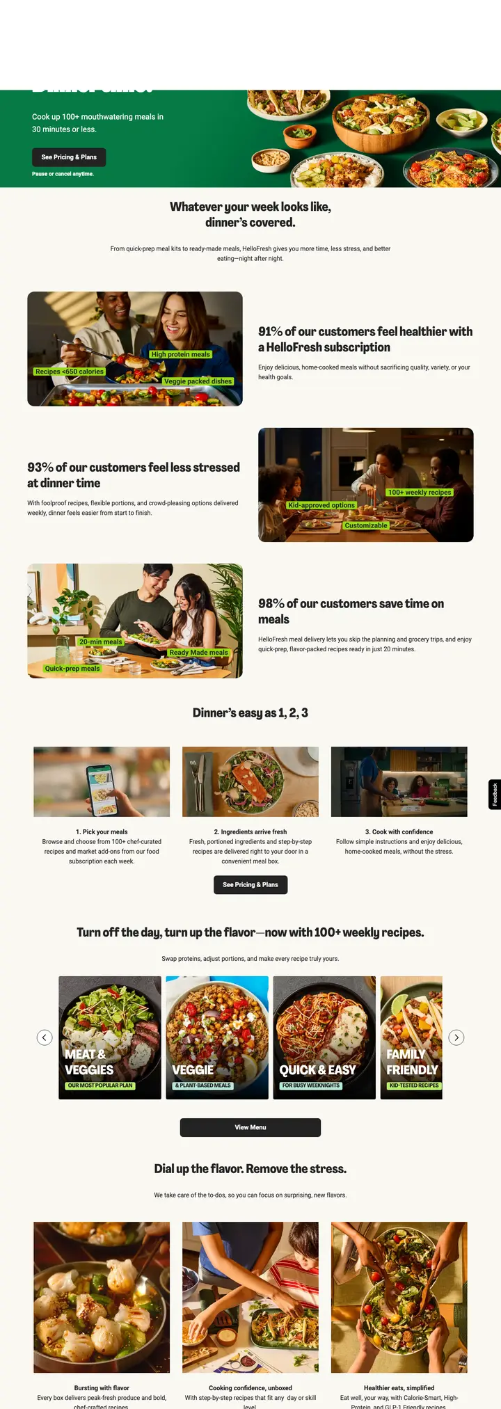
HelloFresh subscription homepage above the fold, captured 5 November 2026
View the full-page captureHelloFresh subscription homepage full page capture
Subscription homepageMeal kits

HelloFresh

A subscription page that handles the biggest objection, commitment, in the line directly under the button.

Search intent it fits
Subscription intent: "meal kit delivery", "meal delivery service", brand terms
Where it fits in the account
Brand and warm audiences. For cold non-brand, a plan-and-pricing page usually fits the search better than a homepage.

What is on the page

  • Hero promises 100+ meals in 30 minutes or less, with one button: See Pricing & Plans.
  • "Pause or cancel anytime" sits in small type directly under that button.
  • Three survey-style percentage claims come right after the hero.
  • A three-step explainer follows, then menus by diet type, then an FAQ.

Copy this

  • Put the cancel and pause promise right under the subscribe button.
  • Use a three-step "how it works" block to make the commitment feel small.
  • Group the product by customer type, like diet, so each visitor finds theirs.

Avoid this

  • Survey percentages need a visible source and sample. Do not copy numbers you cannot back up.
  • Make recurring billing terms obvious. Hidden subscription terms are a policy and chargeback risk.
Visit the live page
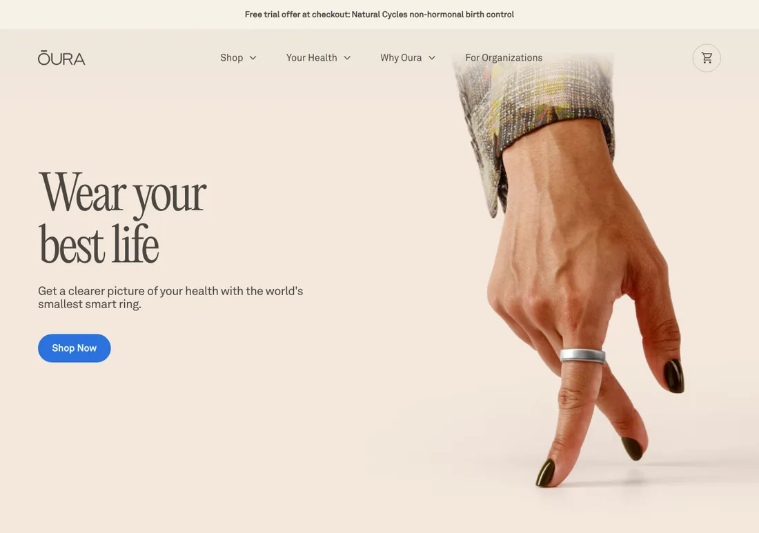
Oura brand homepage above the fold, captured 5 November 2026
View the full-page captureOura brand homepage full page capture
Brand homepageWearables

Oura

A brand homepage that earns the click with a single button, then stacks outside proof.

Search intent it fits
Brand queries: "oura ring", "oura ring 5", "smart ring"
Where it fits in the account
Branded Search and branded Shopping only. A homepage is too broad for non-brand ads on a considered purchase.

What is on the page

  • One headline, one line of supporting copy and one button above the fold.
  • A member outcome statistic with a footnote sits mid-page.
  • Quotes from named publications are repeated as a proof block.
  • A page section explains how sleep is measured and how accuracy is validated.

Copy this

  • Keep one button above the fold. Do not split attention on a considered purchase.
  • Quote named publications by name, not just logos.
  • Add a short "how we measure" section for products that make performance claims.

Avoid this

  • Health outcome claims are policy-sensitive in Google Ads. Keep wording to what you can substantiate.
  • Do not use a brand homepage as the landing page for non-brand ad groups.
Visit the live page

Landing page questions

What makes a good Google Ads landing page for ecommerce?

It matches the search query in the first screen, shows price, stock and shipping that agree with your Merchant Center feed, and puts trust signals near the buy button. The page type should follow the intent: a product page for a product search, a collection page for a category search, a comparison page for a which-one search.

Should I send Google Ads traffic to a collection page or a product page?

Send exact product and model searches to the product page. Send category and modifier searches, like cookware sets or cooling sheets, to a collection page with filters that match those modifiers. Broad Shopping and PMax traffic with no specific product in mind usually converts better on a best-sellers or category page.

Are advertorials and listicles safe to use as Google Ads landing pages?

They carry more policy risk than a store page. If the page looks like independent editorial but is written by the advertiser, it can be flagged as misleading. Disclose that you are the seller, show the criteria behind any ranking, and keep claims substantiated.

How do I judge whether a landing page is working?

Compare pages on ROAS by conversion time, not on last-click conversion rate alone. A page can convert fast but attract low-value orders, or convert slowly and pay back later. Test one page change at a time and read results over the same conversion-time windows.

Do these pages show their conversion rates or ad spend?

No. These are public pages that were captured and annotated for what is on them and how they fit search intent. We do not know their performance and we do not claim they run Google Ads. Treat each annotation as a hypothesis to test in your own account.

Where should branded and non-brand traffic land?

Branded traffic can land on a product or collection page, or a homepage for pure brand searches. Non-brand traffic should land on the page that matches the query, because a homepage forces the shopper to search again. See the annotations on each page for where it fits.

Looking for ad copy instead of pages? See the Google Ads swipe files.

Want pages like these built for your brand?

Shopiator structures the account and the landing pages together, so each search lands on the page that fits it.

Join the Waitlist